
Carrier Pulse is your high-level overview of carrier performance in Harmony. This view focuses on Year-to-Date (YTD), prior year YTD, and the full calendar year, giving you a flexible snapshot of how carriers are performing across time frames.
The tool has proven especially valuable for new customers—accelerating time to value by delivering immediate insights into aggregated carrier data even while full report sourcing is still underway.
For well-established customers, Carrier Pulse serves as the launch point for smarter carrier conversations. By providing a single view of carrier data across multiple formats, it helps you spot trends early, align placement strategies, and engage carriers with clear, actionable insights—before diving deeper into the Carrier Production tab.
Quick Navigation
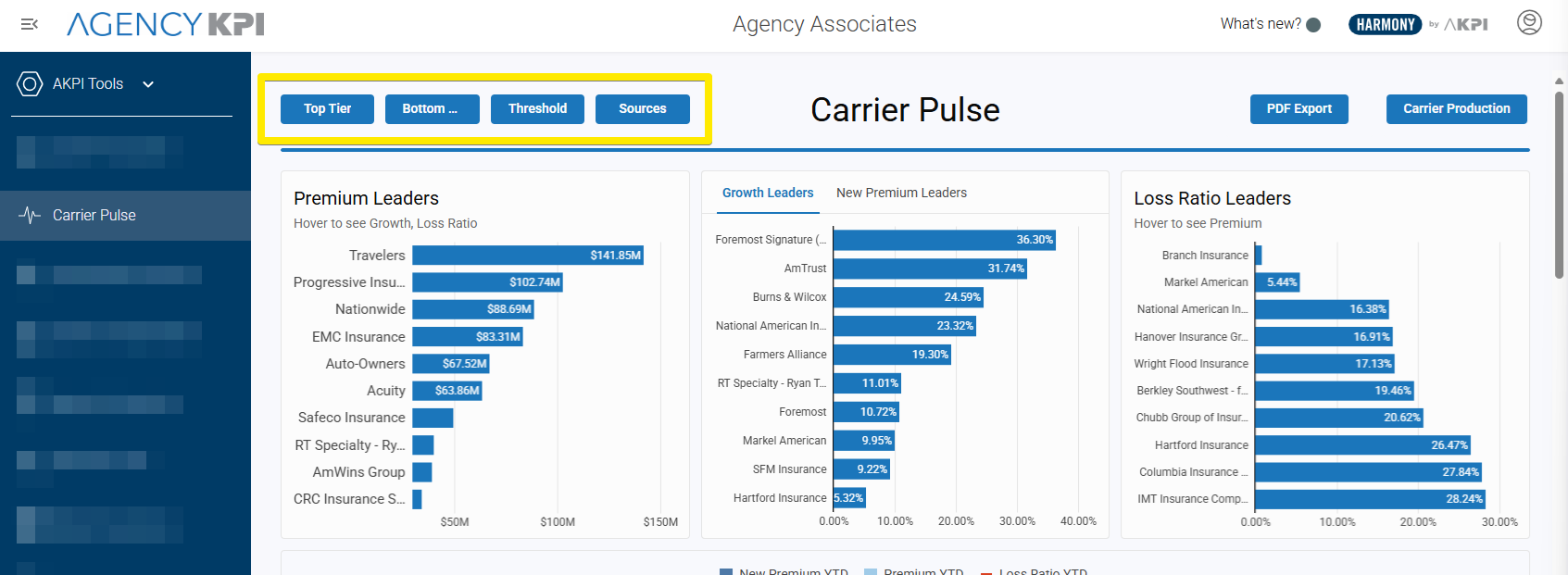
To make insights easier to find, the Carrier Pulse page includes four quick reference buttons across the top of the page. Each button takes you directly to a focused view of carrier performance:
-
Top Tier – highlights the best-performing carriers, with charts and tables showing premium leaders, growth leaders, and strong loss ratios.
-
Bottom Tier – focuses on underperforming carriers, making it easier to spot those with weaker growth, declining premium, or poor loss ratios.
-
Threshold – provides an interactive way to set performance boundaries:
-
Enter premium floor/ceiling values.
-
Enter growth YTD% floor/ceiling values.
-
Enter loss ratio YTD floor/ceiling values.
Just hit Enter after inputting your numbers, and the Details table will filter automatically to reflect carriers within those thresholds.
-
-
Sources – shows the origin of the data (Carrier Production or Carrier Portal). A Top of Page button here makes it easy to return to the navigation bar.
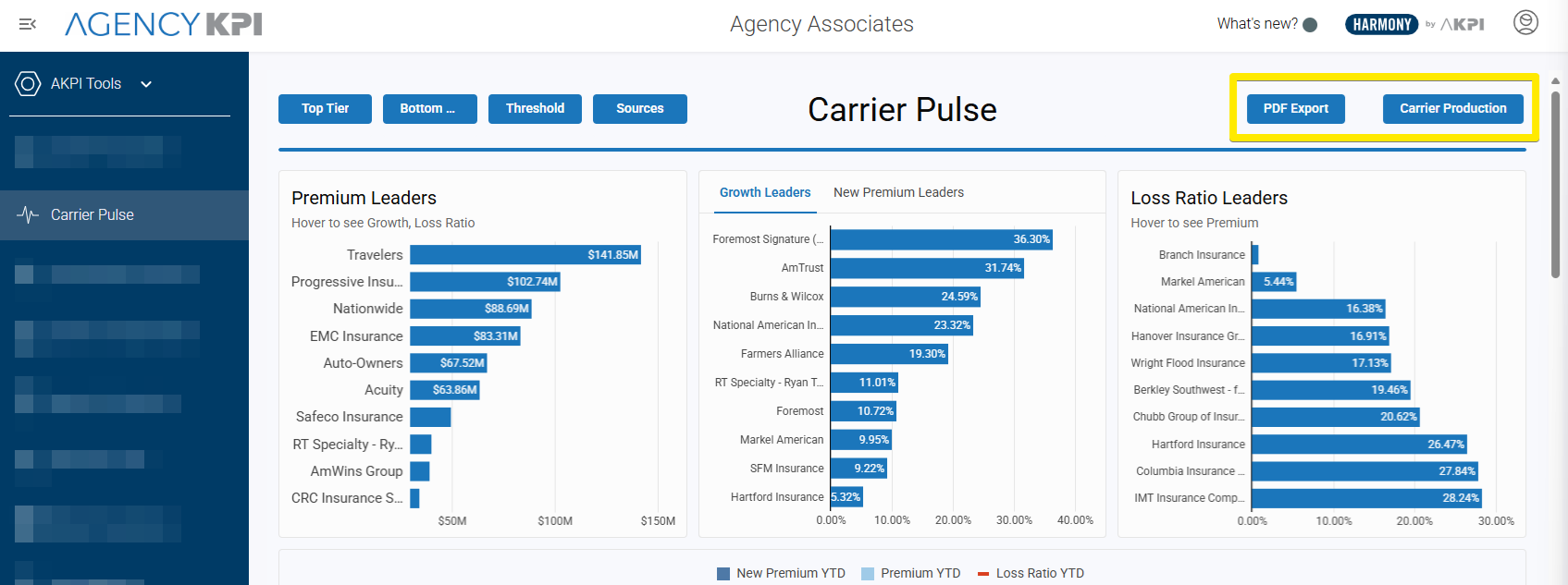
Action Buttons
In the top-right corner of Carrier Pulse, you’ll find two additional tools to keep analysis moving:
-
PDF Export – capture the entire Carrier Pulse page as a PDF “snapshot,” exactly as you see it on screen.
-
Carrier Production – link directly into the Carrier Production tab, the deeper detail view for sourcing carrier data.
At-a-Glance Charts
Just below the navigation are interactive charts designed to highlight carrier leaders and overall performance.
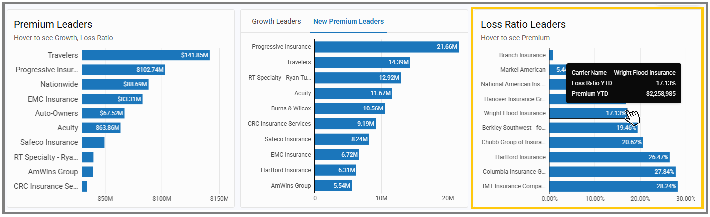
Premium Leaders
-
Displays the Top 10 carriers by written premium.
-
Each bar represents a carrier, with the length showing total premium.
-
Hover to see additional detail on growth and loss ratio.
Growth Leaders / New Premium Leaders
-
Highlights carriers with the strongest growth percentages.
-
Toggle to New Premium Leaders to view carriers leading in new business premium instead.
-
Hover to see exact premium or growth values for each carrier.
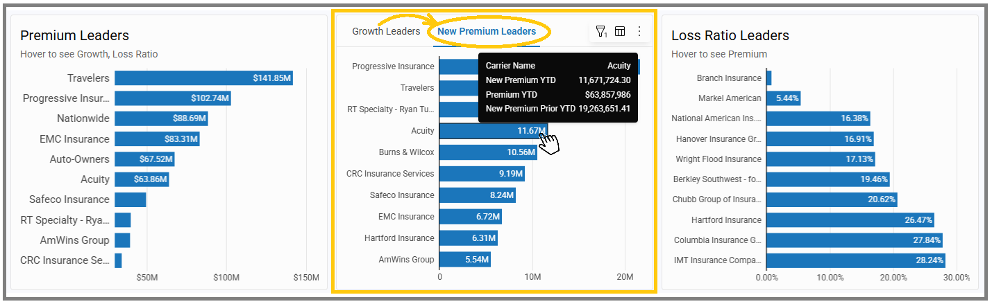
Loss Ratio Leaders
-
Shows carriers with the most favorable loss ratios.
-
Each bar represents a carrier, with the length showing their loss ratio percentage.
-
Hover to also view premium context.
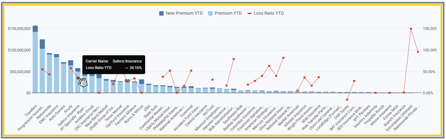
Carrier Performance Overview
Beneath the leader charts is a comprehensive comparison chart showing all carriers side by side:
-
Two blue bars display each carrier’s Premium YTD and New Premium YTD.
-
A red line with data points shows the carrier’s Loss Ratio YTD.
-
Dollar amounts run along the left side, percentages along the right, making it easy to see production totals alongside loss ratio performance.
-
Carriers are listed across the bottom, giving you a complete market view at once.
This overview provides a balanced look at both production and performance—helping you quickly spot which carriers are driving the most premium, which are bringing in new business, and how they’re performing from a loss ratio perspective.
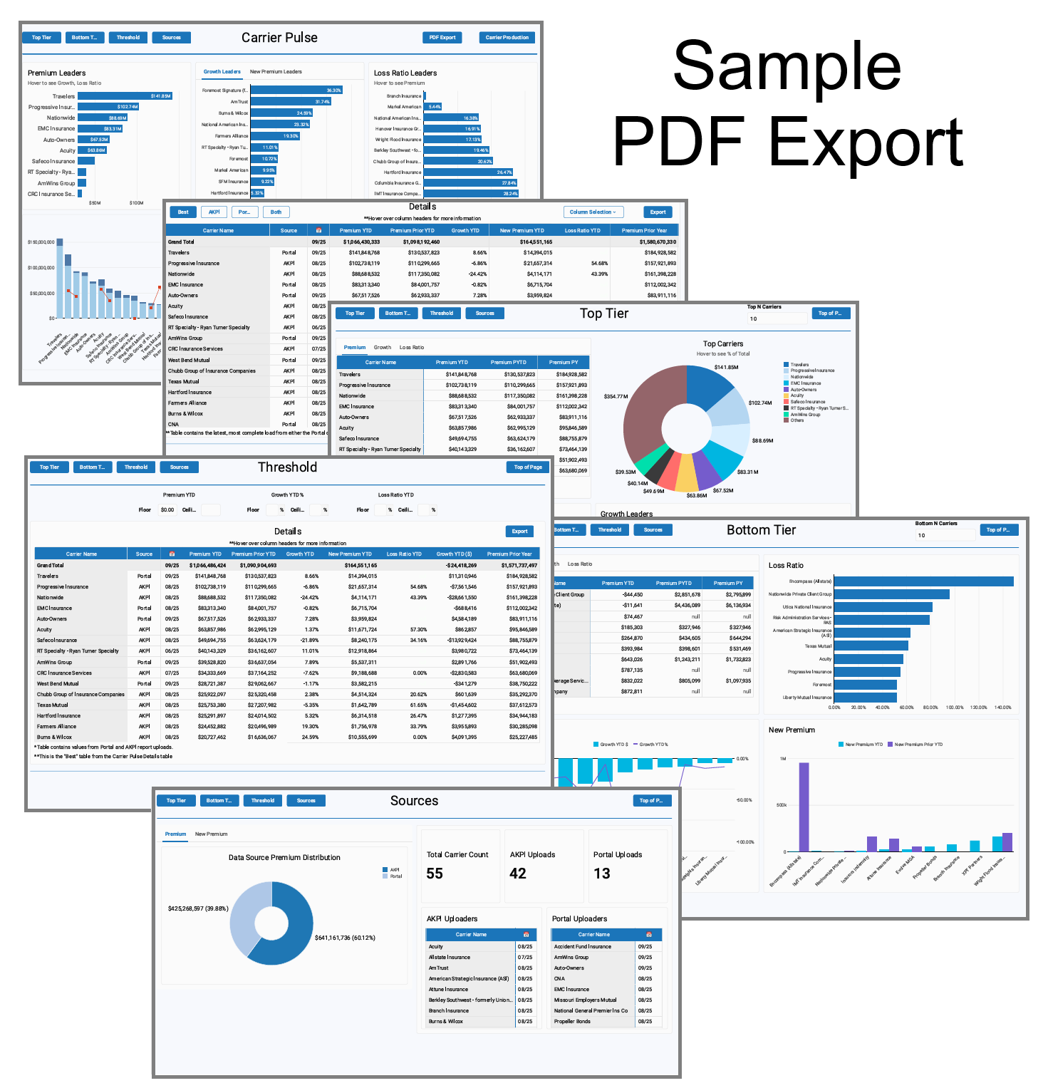
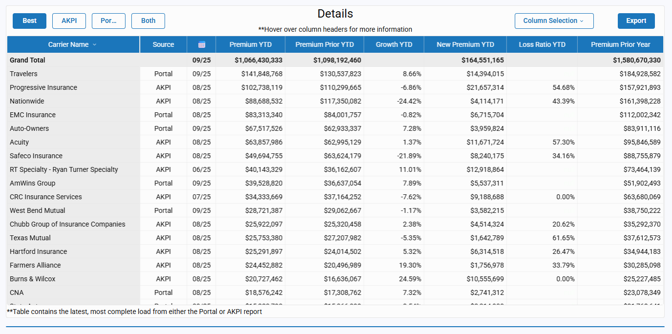
Details
At the bottom of the page is the Details table—the section where all sources come together.
Source Views
Toggle between four perspectives:
-
Best – the most complete view.
-
AKPI – data sourced from Carrier Production.
-
Portal – data captured from carrier portal downloads.
-
Both – side-by-side comparison of AKPI and Portal values.
Note: In some cases, portal values may be displayed in place of AKPI values when both sources are provided. This typically occurs when historical data (such as prior-year months) is missing from the Carrier Production report. Using the portal source ensures the view remains as complete and accurate as possible.
Table Details
Each row represents a carrier, with available columns including:
-
Source
-
Last Sourced Date
-
Premium YTD
-
Premium Prior YTD
-
Growth YTD (%) and Growth YTD ($)
-
New Premium YTD
-
Loss Ratio YTD
-
Premium Prior Year
Click Column Selection to adjust which columns are displayed and tailor the table to your analysis needs.
Export Options
Click Export to download the table for offline use or deeper custom reporting.
Why It Matters
Carrier Pulse is designed to give you fast, actionable insights—whether you’re just getting started or managing ongoing performance.
-
For onboarding: It delivers quick wins with immediate YTD and prior year carrier data, even before all detailed reports are sourced.
-
For daily use: It highlights top performers, underperformers, and trendlines at a glance.
-
For strategy: It supports quick conversations with carriers and helps you decide where to focus next.
When you’re ready for granular, agency-level or line-of-business analysis, use the Carrier Production tab as your detail view.
Start using Carrier Pulse today to transform data into action. Whether you’re onboarding, reviewing daily performance, or shaping long-term strategy, Carrier Pulse gives you the clarity you need—fast. And when it’s time to dig deeper, the Carrier Production tab is only one click away.

