Percentage Color Guide

Nov 13, 2024
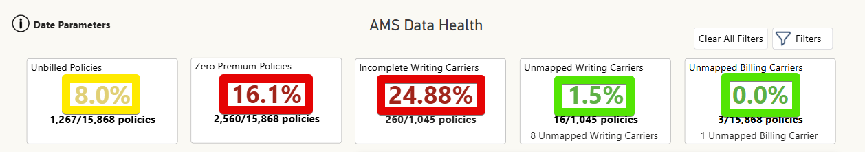
The percentages listed in the top cards are displayed as follows:
0-5% will be green
16-15% will be yellow
15% and above will be red
The lower the percentage the better.
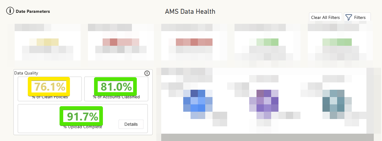
The percentages listed in the Data Quality table are displayed as follows:
80-100% will be green
60-79% will be yellow
59% and below will be red
The higher the percentage the better.